NICO MAGGIOLI

NICO MAGGIOLI

underStanding the why

The 'why' creates impactful design. Every detail in my work, every color, form, name, typeface, and size, is a deliberate choice backed by reason.

underStanding the why

The 'why' creates impactful design. Every detail in my work, every color, form, name, typeface, and size, is a deliberate choice backed by reason.

Why these colors?

Jungle Glow (Green): This soft green symbolizes the use of all natural ingredients while also hinting at freshness and cleanliness for your home after there's going to be no more scratches!

Azure Dream (Blue): This calming blue represents the peace of mind that Pawlish provides, knowing your dog is protected from slips and your floors from scratches. It’s a color that evokes trust and reliability, making it perfect for a product designed to care for your pet.

Pinkalicious (Pink): This fun and vibrant pink brings a splash of personality, perfect for dogs who love to stand out. It’s playful and bold, adding a touch of flair while still keeping your home and your dog safe from unwanted slips or scratches.

Why this form?

The form of Boreal ski bindings is intentionally designed with a brutalist aesthetic, embodying safety, strength, and reliability. The angular, solid shape conveys a sense of protection and durability, ensuring you can trust these bindings on the toughest slopes.
Beyond aesthetics, the design integrates advanced features like theft protection and progress tracking, making it visually robust and technologically forward, offering peace of mind and functionality to skiers.

Why did I Riso print this?

I chose to Riso print this comic as a playful contrast between old and new technology. Since Cognis explores the future and AI, it felt fitting to use a retro printing aesthetic like Riso, emphasizing the blend of classic craftsmanship with futuristic themes. The irony of using older tech to print a story about cutting-edge AI gives the project a unique, nostalgic edge while staying rooted in futuristic concepts.

Why The cards?

Cool binoculars alone weren’t enough to fully engage the kids, so the card game was introduced to make Nestquest even more interactive and exciting. The idea was to give kids a tangible reward for their discoveries, turning birdwatching into a fun, competitive experience.

By collecting and trading cards, they stay hooked and motivated to explore, learn more about the birds they spot, and share their findings with friends.

The card game adds an element of surprise and achievement, making nature exploration more than just looking, it's about collecting, trading, and learning.

Why this audience?

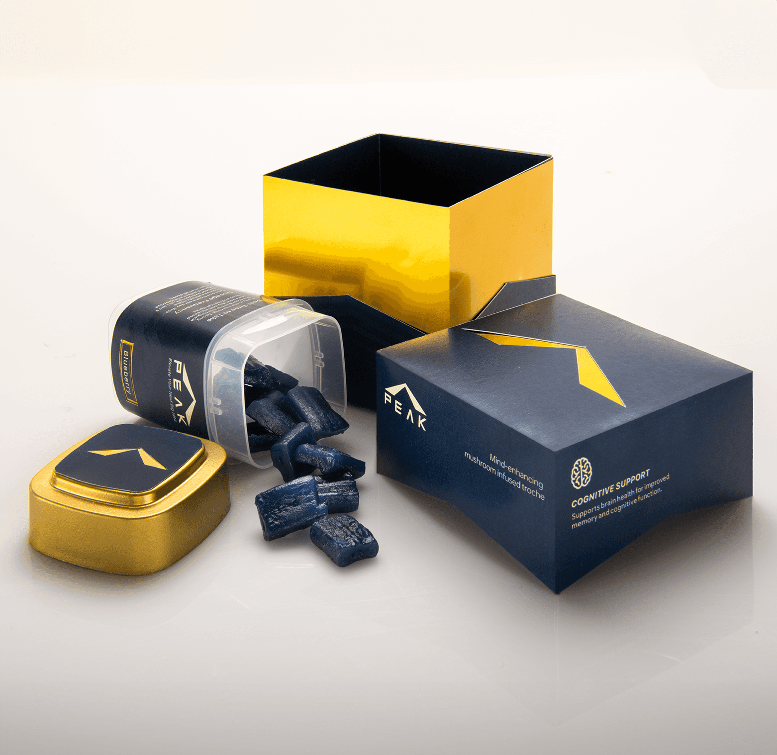
Peak is designed specifically for entrepreneurs because they need every advantage to stay ahead in the fast paced world of business. Entrepreneurs are constantly on the move, juggling multiple tasks, and striving to maximize productivity.

This Lion’s Mane infused troche offers a quick and convenient way to boost focus and mental clarity without slowing them down. By targeting entrepreneurs, Peak provides a solution that aligns perfectly with their goals, helping them stay sharp, focused, and ready to tackle whatever challenges the day throws at them.

Why this Logo?

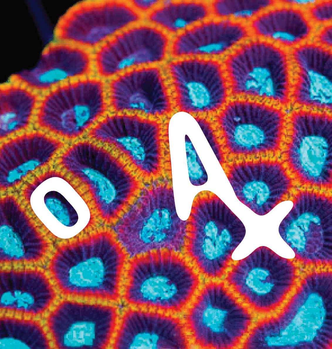
The OXA logo was directly inspired by the natural, intricate shapes of favia coral, which is known for its natural ability to clean the ocean. By outlining the flowing forms of the coral, the logo reflects the harmony between nature and technology that OXA embodies.

The design communicates the core function of OXA to purify and detoxify indoor air while the name, short for oxygen, reinforces its purpose of providing cleaner, fresher air. The logo mirrors the elegance of coral, combining aesthetics and purpose in a simple yet meaningful design.

Let's connect!

Let's connect!

Let's connect!